English
  Vietnamese
 If Tesla Motors is to achieve the aggressive goal of making 1 million cars by 2020 set out by its CEO Elon Musk, it will partly be because of the application of data analytics in its manufacturing operations.
Overview
- Data analytics for manufacturing
- Blindness to data
- Tableau’s advantages
- Looking at data from different angles
- Process monitoring
This April marked a historic moment for the automotive industry when Tesla briefly became the US’ most valuable carmaker. Its market capitalisation reached US$51 billion on April 10, surpassing US$50 billion of General Motors (GM) and US$45 billion of Ford.
Why do investors value Elon Musk’s electric car manufacturer more than GM and Ford even though Tesla’s 2016 sales volume was only 76,000 vehicles, a fraction of Ford’s (6.6 million) and GM’s (10 million), and it is still in the red, posting a net loss of US$675 million last year?

Musk’s bold vision for the future of transportation, in which all vehicles will eventually be all-electric and fully autonomous, certainly plays an important part. To make that vision a reality, CEO Elon Musk has set ambitious goals for Tesla for production capacity.

In 2013, Tesla delivered just around 20,000 Model S full-size sedans, the company’s first series production vehicle. 3 years later, the annual production rate reached 100,000. And Elon Musk is aiming to deliver 500,000 vehicles by 2018 and 1,000,000 by 2020.
Last December, the city of Fremont, California, approved Tesla’s plans to double the size of its factory there. There will be an additional 420,000 square meters of manufacturing space. And the number of workers is expected to increase from 6,000 to 9,000.

This massive expansion is crucial as Tesla’s product line continues to grow rapidly. Prior to 2015, the Fremont factory only built the Model S, which was later joined by the Model X SUV. Production of the more affordable Model 3 is scheduled to commence later this year. At present, Tesla has received over 370,000 pre-orders for Model 3.
Such rapid production growth and aggressive goals can undoubtedly create a lot of chaos. And Tesla is no stranger to missed deadlines. According to the Wall Street Journal, the company has failed to meet its projections more than 20 times in the past 5 years. As part of the ongoing effort to tame chaos and improve manufacturing efficiency, Tesla has turned to advanced data analytics software.
Data analytics for manufacturing
Tesla production data is fed into several different key systems. The first major one is in the MES (Manufacturing Execution System). This software essentially is the air traffic controller of the entire production process. It can tell a certain item in the assembly line where it should be heading, keep track of the production orders and quality issues, and collect basic measurements. The MES uses Oracle/SQL Server databases.
More in-depth and customised test data is stored in a separate MySQL Test database which was developed by Tesla’s in-house dev team. Additionally, the web-enabled QuickBase is also used to track process changes and ongoing quality issues due to its flexibility and ease of use. And finally, Excel spreadsheets are used for one-off manual reports.
Not only does data go into many different places, but it also has to serve highly diverse audiences, who have very different interests. Whereas people working in Production care about yield and rework calculation, people in Equipment Sustaining may care about preventive maintenance, and people in Process Sustaining are interested in root cause investigation. Sometimes, people do not know where to get the data they need.
Read more: Business Intelligence in the Manufacturing Industry

‘Blindness to data’
Apart from a wide variety of databases and data reporting needs, there were plenty of different tools employed by Tesla staff. Most relied on Excel or an in-house app built on LabView, and a select few knew how to use MySQL Workbench or R.
This situation caused a lot of frustration when people had a hard time looking for the right data. Bottlenecks were created since only a handful of people had direct access to most data as well as the expertise to use advanced data analytics tools. And because the majority of staff had to use Excel for data handling, the process was slow and inefficient. Consequently, people were often unaware of what was going on in other parts of the production line.
The top data reporting needs are:
- Production counts and yield
- Quality defect tracking/analysis
- Statistical Process Control (SPC) and Process monitoring
- Root-cause investigation
- Open-ended data exploration
- Statistical analysis - DOE, GRR, etc.
It is worth noting that most of these reporting needs are heavy on data visualisation and data exploration rather than on statistics and scripting. This played an important part in Tesla’s decision to adopt Tableau data analytics software.
Read more: 3 Best Business Intelligence & Analytics Vendors 2017

Tableau’s advantages
One distinct advantage of Tableau is “data source agnostic”, i.e. users no longer have to care where the data comes from. They can pull any data from any source at any time. They can view data located in MES, Test DB, QuickBase or Excel files side-by-side on the same dashboard.
Tableau also allows ordinary users, even those who are not programmers, to easily create powerful and tailored visualisations. Before that, they would have had to spend at least 6 months learning R to build such data visualisations.
Another huge improvement brought about by Tableau is publishing and sharing. In the past, those capable of using analytics tools often had to export their works and send them to others via email. This approach was time-consuming and lacked interactions. Conversely, Tableau users can easily publish their works and let others interact with them on their web browsers.
In the next sections, we will explore some applications of Tableau in building production reporting tools at the Tesla factory.
Looking at data from different angles
To have a complete picture, people need to be able to look at and drill down data from multiple angles. Then trends and patterns are much easier to detect.
The following visualisation workbook shows 3 different views of a single set of data: the number of quality issues.
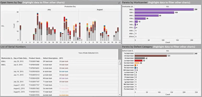
The top left visualisation shows the defect counts over time. The top right visualisation counts the number of defects by work centres. And at the bottom right corner is the visualisation of defects by categories.
Users from Process Sustaining use this workbook in their day-to-day jobs. They can drill down the data in any way they want. For instance, they can easily see the number of defects in each work centre by dates and by categories just by clicking on that particular work centre.
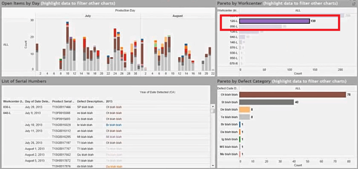
Then they can filter down even further by clicking on a defect category and see the number of that specific defect type over time.
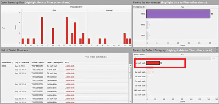
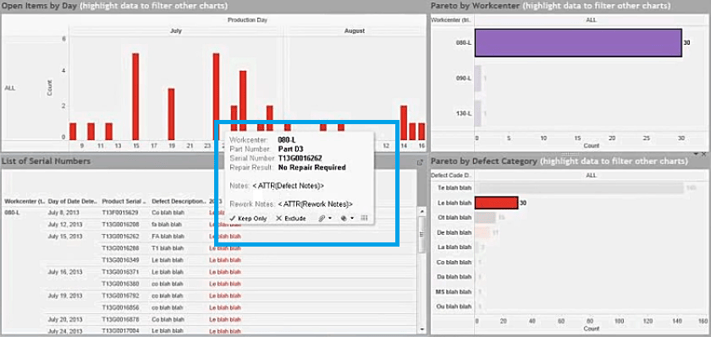
The bottom left corner is where users can see the detailed information on each quality defect, including notes from individuals who conducted the inspection. So users can perform a context drill-down from high-level data to individual serial numbers on the same screen.
Process monitoring
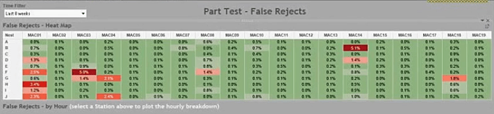
The following dashboard monitors the number of false part rejects, which happen when parts are scanned by barcode scanners and falsely rejected. This could be due to several reasons. The parts may not be held at the right angle towards the scanners or the scanners are misaligned.
The following dashboard shows data from 19 work centres (MAC01 to MAC19); each has 10 nests (A to J) where the barcodes are scanned. The false reject rates are represented by colours. A green nest means the false reject rate is within the limit.
Users can click on one particular work centre and see the trends of false rejects of individual nests over time. More important, they can pull equipment logs of the same period of time from a separate database and see if someone has already logged the scanners down and alerted the maintenance crew and if the false reject rate of a scanner has dropped after it was repaired.
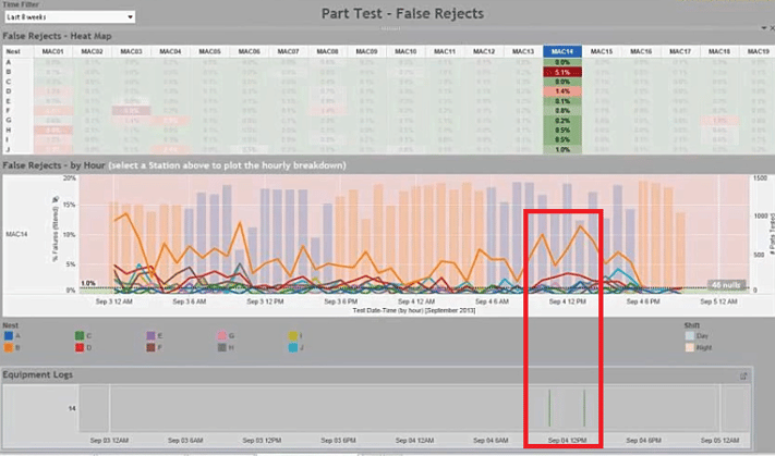
In this particular case, there were 2 maintenance alerts put in for the scanner of nest B / work centre MAC14. And the rate has gone down after the 2nd repair.
The point of such process monitoring is to be able to see not only what is going on but also the deeper context of the actions taken.
This is the 1st part of our article. Please read the second part or subscribe to our blog for the latest content about Business Intelligence and Analytics.
You can also request a Tableau demo to see how this solution can help your business.