In the previous post, we discovered why data analytics is important to Tesla and applications of Tableau software at this electric car maker. In this post, we will further examine other applications.
Overview
I. Production Counts and YieldII. Take only what you need
III. Statistical Process Control
IV. Failure diagnosis – Slicing by Variables
V. Open-ended Data Exploration

Production Counts and Yield
Any production organisation would want to keep track of its production counts and yield on a regular basis. Tableau’s dashboards allow Tesla’s managers and supervisors to know how many parts they have built hour by hour or over a longer period of time and see if they are on track.
In the dashboard depicted below, which gathers data from the MES (manufacturing execution system), a production supervisor can monitor the number of unique serial parts finished in each day and each shift and compare it to the goal using the top chart.
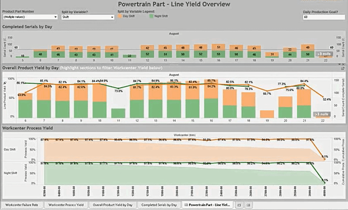
The middle graph tracks the daily overall yield, i.e. the percentage of parts without any quality issue. The bottom chart breaks down the yield by different work centres, i.e. different steps in the production process.
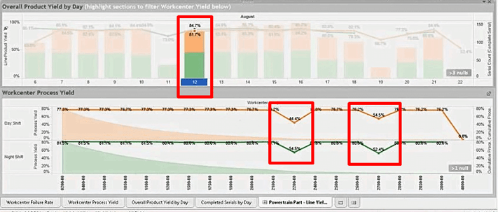
The dashboard enables users to quickly filter data of particular days by just clicking on the chart and see if there is any work centre that consistently has problems. Users can also slice the data by parts.
Read more: Revisiting the Origins and Definition of Business Intelligence
Take only what you need
One significant part of Tableau implementation at Tesla is data extraction. Users can set up a specific extract to grab only the data that is useful to them. For instance, a user may only care about the quality test results or the production yield of the last 2 weeks. Or they can set up the system to get a full extract once a week plus an incremental extract every one hour. Users can also establish live connections if they so wish.
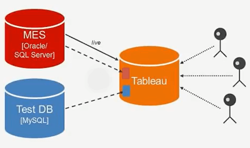
This flexibility in data extraction is hugely important considering the massive amount of data the system has to deal with. Databases can have up to 2 million rows added per day. By taking and analysing only what users need, the queries run a lot faster.
Read more: 3 best Business Intelligence & Analytics vendors 2017
Statistical Process Control
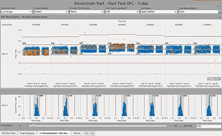
The following dashboard consists of statistical process control charts of various quality metrics. Such dashboards allow the Tesla to understand what is going on and spot potential problems before they get out of hand. This is especially important to a fast-growing manufacturing organisation like Tesla.
Infographic: 4 Steps to Automate Enterprise Data Management
Failure diagnosis – Slicing by Variables
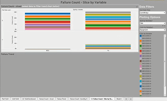
Tesla’s production involves a lot of complex assemblies. And for each assembly, there is a multitude of failure variables – shifts (day or night), equipment, sub-components, etc. So having an ability to view data from different angles and explore the relationships among failure variables is critical.
The following visualisation shows the number of failures sliced by the variable of “Equipment”. Each piece of equipment is represented by a different colour. Apparently, there is no single piece of equipment that stands out.
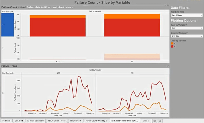
In the next visualisation, there seems to be a relationship between the variable ‘Unit Side’ and the number of failures. It is obvious that there are a lot more failures on Side B (Red) versus Side A (Yellow). Users can also drill down to see the trend of failures over a period of time to discover if there are certain days when the number of failures skyrocketed.
Read more: How a Financial Shared Services Centre benefits from analytics software
Open-ended Data Exploration
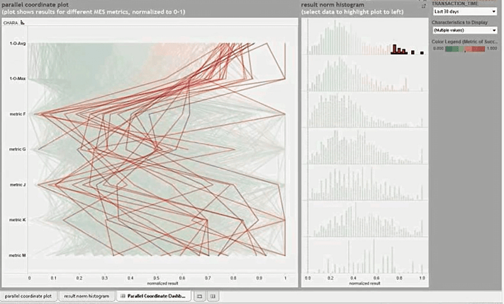
The following visualisation is a parallel coordinate chart. It is used by Tesla engineers to explore and establish correlations, if any, among more than 30 metrics of a component. For instance, if the one metric is high, does it cause any other metric to increase as well?
 English
  Vietnamese


